Website for a Maritime Consultancy
ROLE UX, VISUAL AND INTERACTION DESIGN
TEAM BUSINESS OWNER, DESIGNER, DEVELOPER
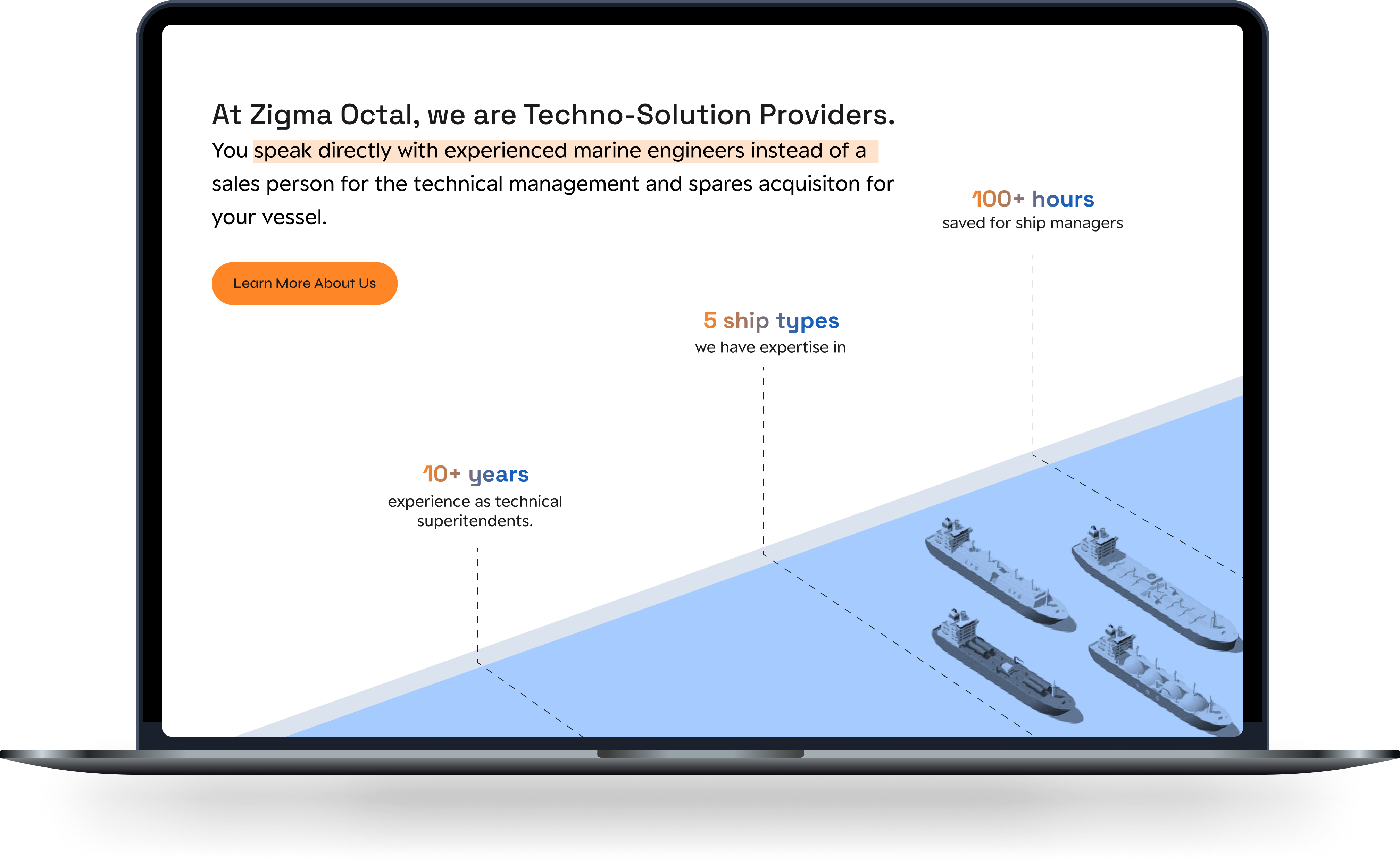
Context
THE BUSINESS
Zigma Octal was founded by a group of 3 ex-maritime engineers with over 20 years of experience out on the sea, managing the operations of a variety of ships on their voyages!
They were setting up a consultancy service to freelance their technical expertise to maritime crews.
CHALLENGE
Establish an online presence for Zigma Octal by crafting an engaging catalog website that showcases their array of services.
Research
The biggest constraint of this project was that no user data was available, and the shipping consultancy industry is quite small. User goals had to be hypothesized based on the business's goals and vision and limited competitor research. Luckily, the business owner knew exactly what they wanted to achieve.
UNDERSTANDING BUSINESS GOALS
I began by meeting with the founder to learn about their business, their prospective customers and the shipping consultancy industry.

An online catalog not an e-commerce site
The company acquired customers through recommendations, not online searches. They wanted to create a website to showcase their services and make it easier for people to learn about them.

Brand memorablity for busy ship managers
Their customers were usually busy ship managers, trying to find a reliable service quickly. The website had to capture their attention, sell their service and keep the business in their memory.

Highlight the unique selling point
The business was unique as their services were provided by marine engineers with decades of experience caring for ships. No one else in India and Singapore provided such a service at the prices.
WHAT IS A MARITIME CONSULTANCY BUSINESS?
Through the founder and scouring the internet, I learned about maritime consultancies. These businesses were few and usually covered customer groups spanning a large geographical range. This differed from Zigma Octal, a new business, starting small, supporting a small number of vessels in India and Singapore.

THE AUDIENCE

PROBLEM STATEMENT
How might we create an effective catalogue website that instils trust in busy ship managers to rely on Zigma Octal to solve their operation problems?
Solutions
UI KIT
The business had a vision. They wanted its brand colours used throughout the website, to be remembered by their colours. They also wanted a "fresh" look that made them stand out from other providers through a "stylish" modern website.
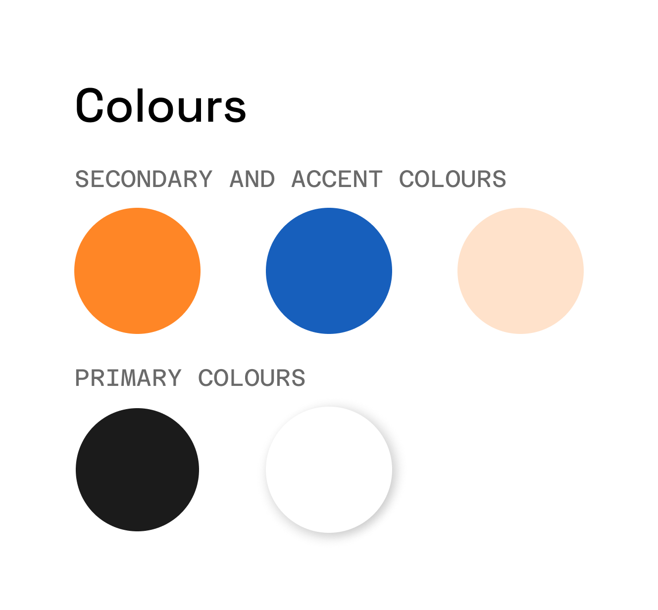
The brand's colours were chosen to be used across the website to highlight and create accents.
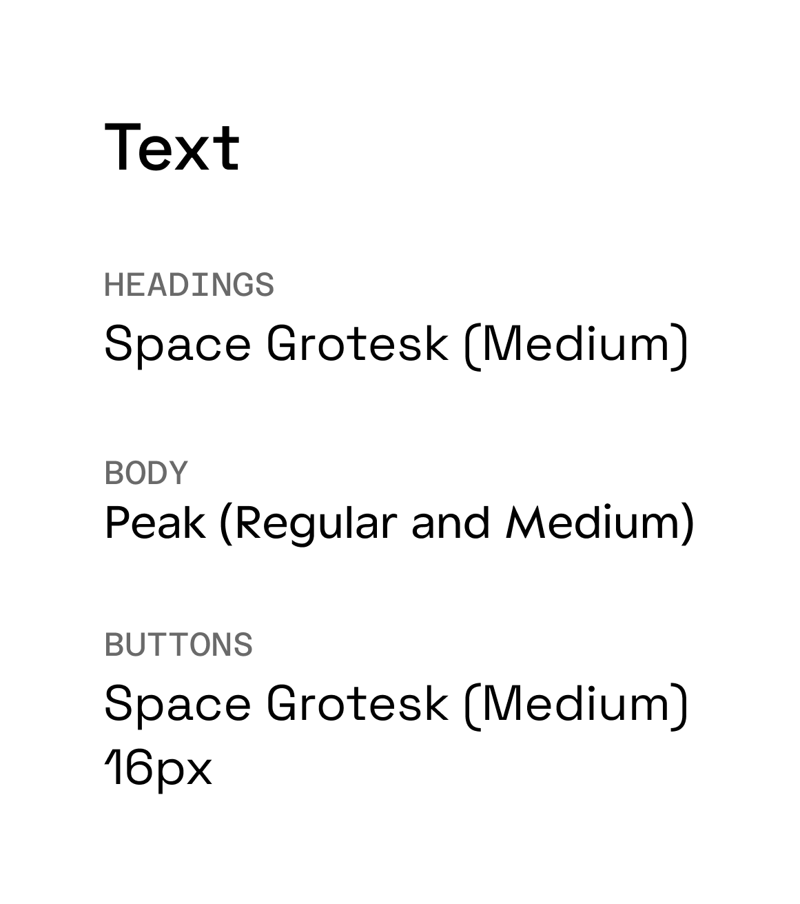
Since the business wanted those colours to shine, I kept rest of the palette neutral and chose accessible complements.
The business wanted no images of ships. But I persuaded them to have at least one, in a non-apparent manner, so we could communicate what the catalogue was for easily. So, we settled on abstract images of ships.
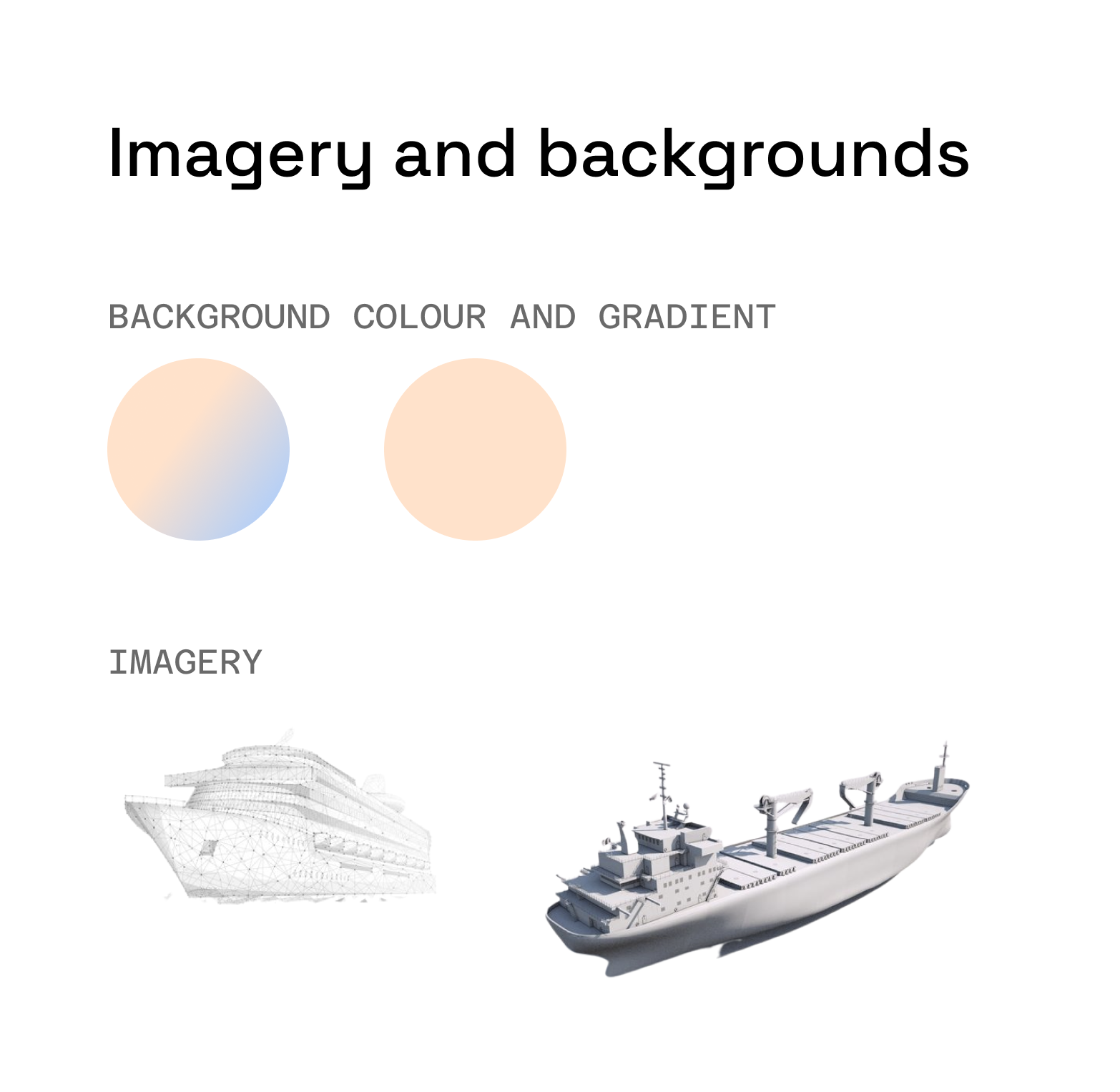
The business wanted no images of ships. But I persuaded them to have at least one, in a non-apparent manner, so we could communicate what the catalogue was for easily. So, we settled on abstract images of ships.
01
RESEARCH INSIGHT
Ship managers are busy people. We need to communicate value instantly.
UX DECISION
Glanceability. Make key information glanceable through interactive animations.
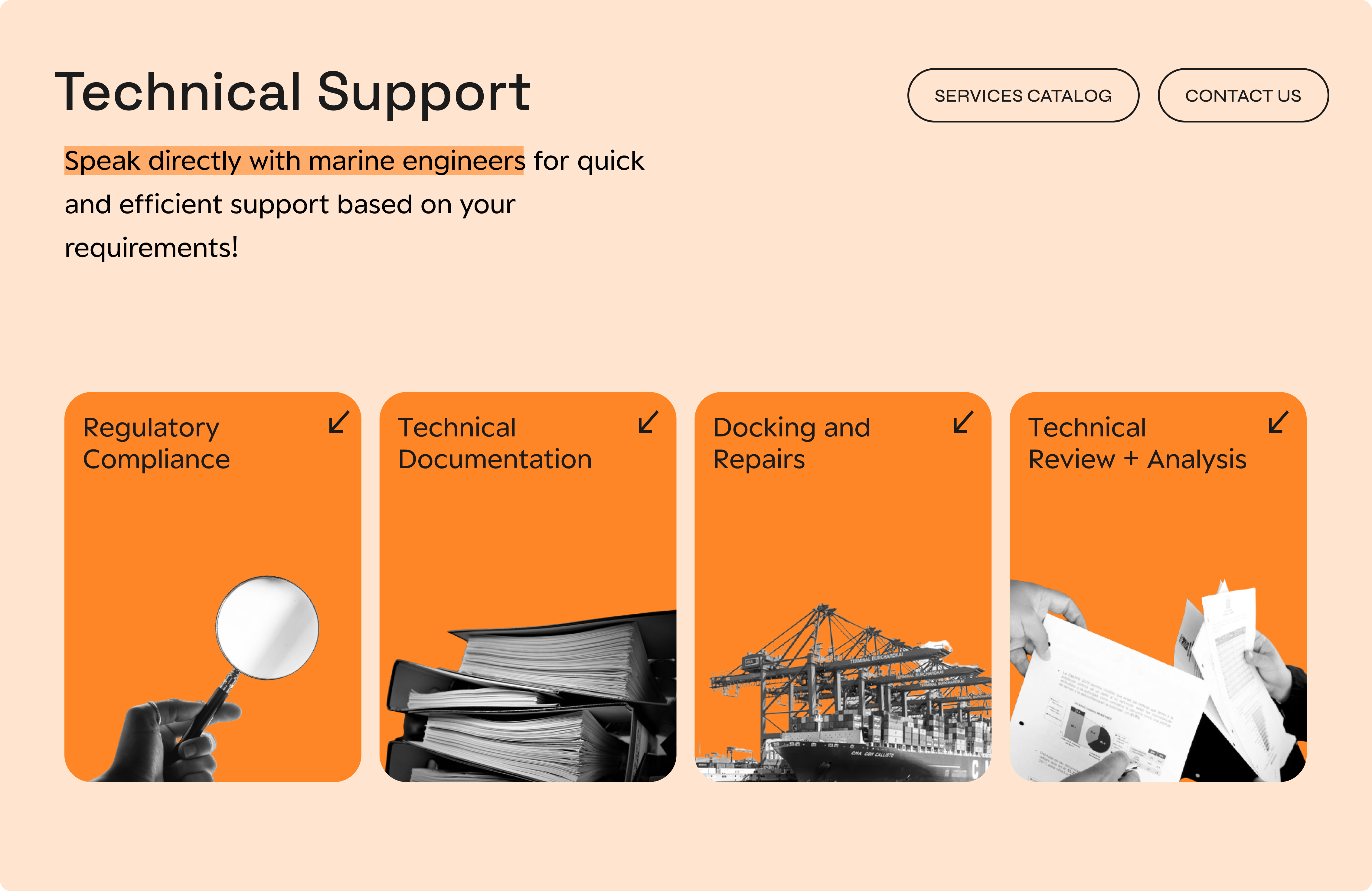
On the header, changing text attracts attention while communicating all offered services right on top. This idea had complete business buy-in.
Since the website is information-heavy, I decided to break down the information using interactive cards that flip to reveal more information. Since all users are expected to be on a desktop, the large cards will not be missed by the mouse pointers to trigger the hover interaction.
02
RESEARCH INSIGHT
Create an impact on ship managers and make the business memorable.
UX DECISION
Use animations and colours at key interaction points to achieve this.
Creating a memory through microanimation
The ultimate goal is for ship managers to contact the business. So, I created a small animation with a confirmation, letting them know when they can expect a reply.
Using colours to highlight
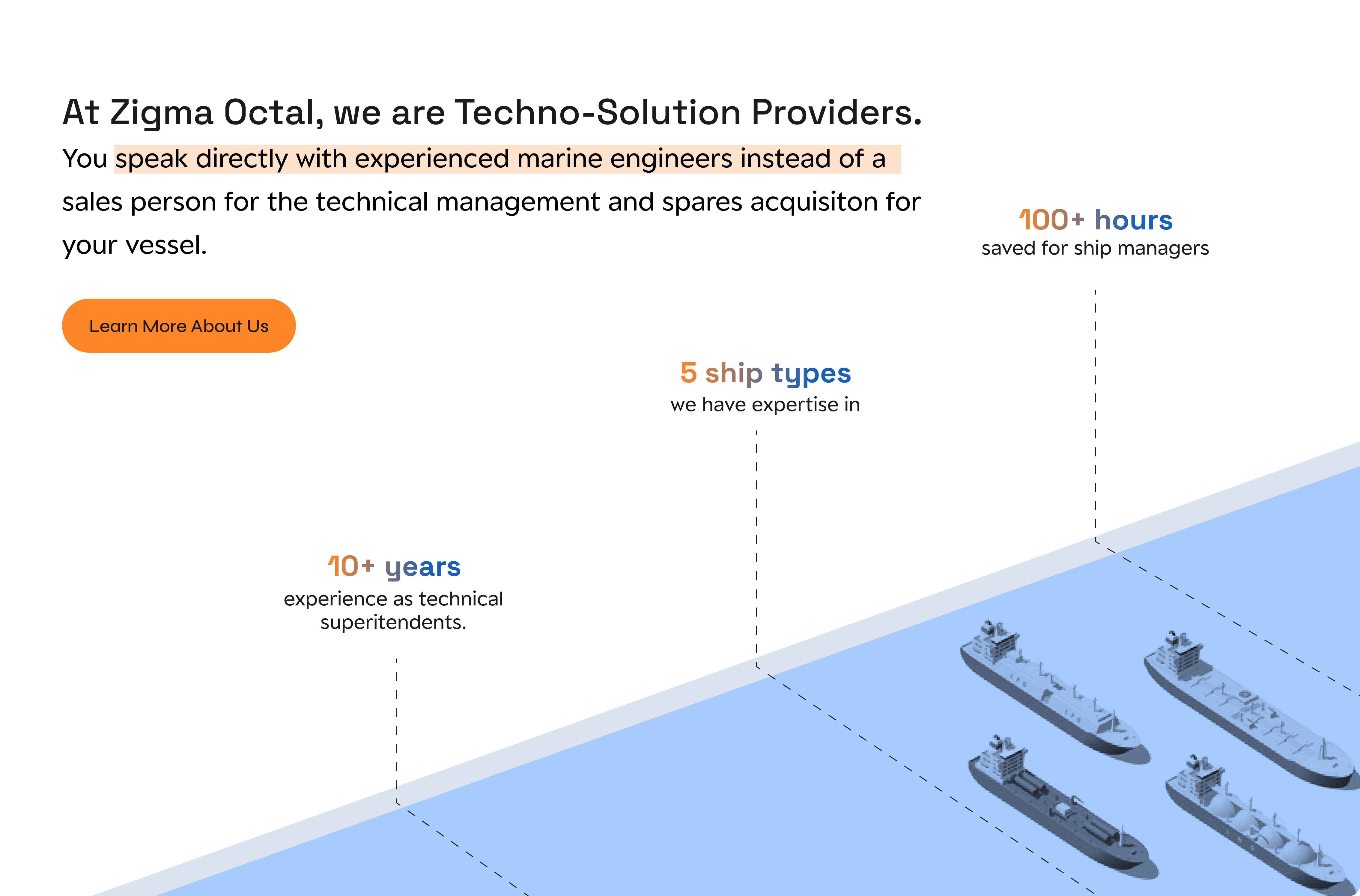
Using the brand's colours, I highlighted key information, including the brand's Unique Selling Point (USP). This was in hopes of getting the USP to form an associative relationship with the brand through colour.
Click through the prototype
Hotspots will guide you as you click through it!
Explorations that did not make it to the final website
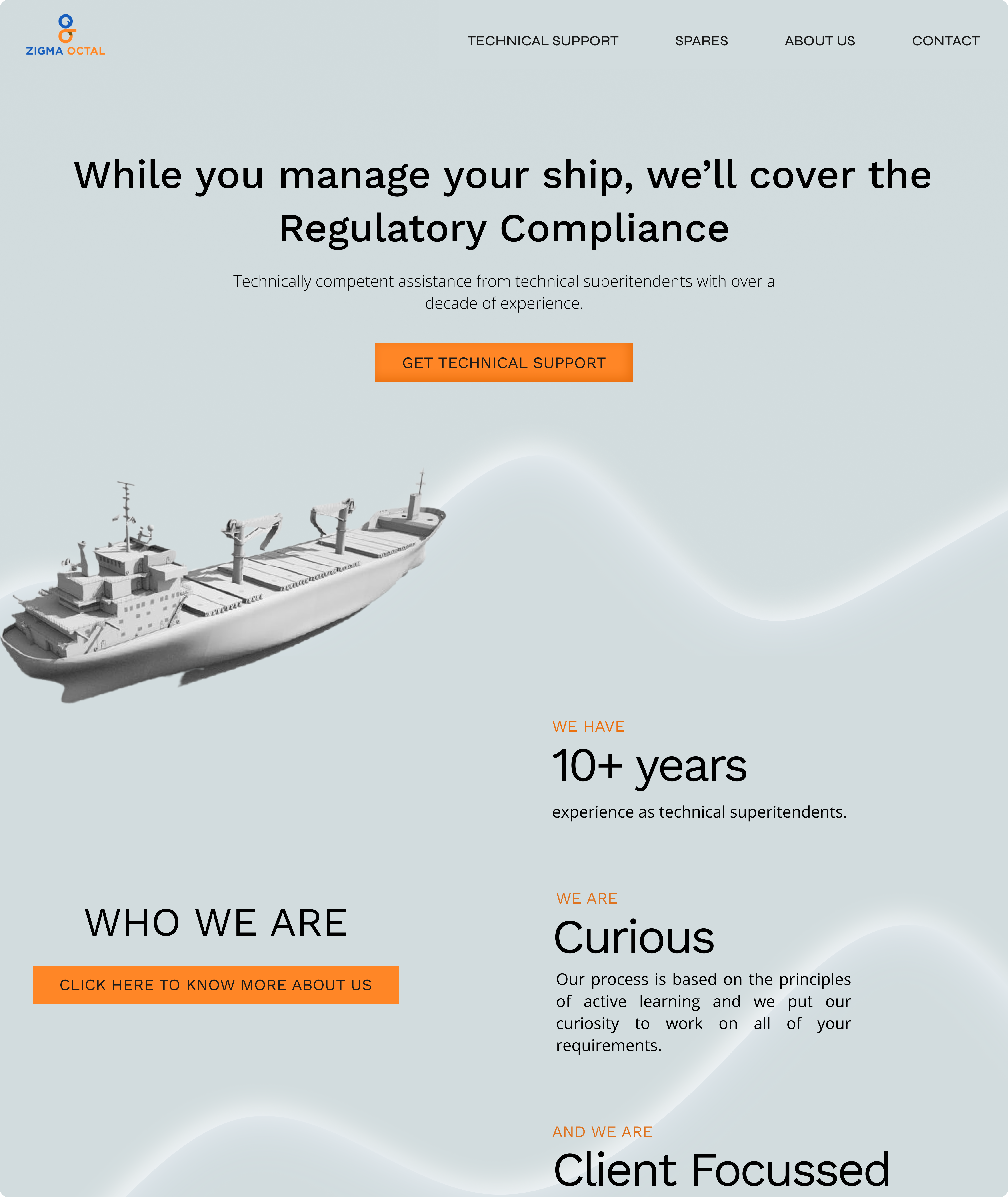
This was my first iteration. "Brand's colours are not communicated. Too dull. We want a white background." The main CTA was supposed to be a prompt to contact the business.
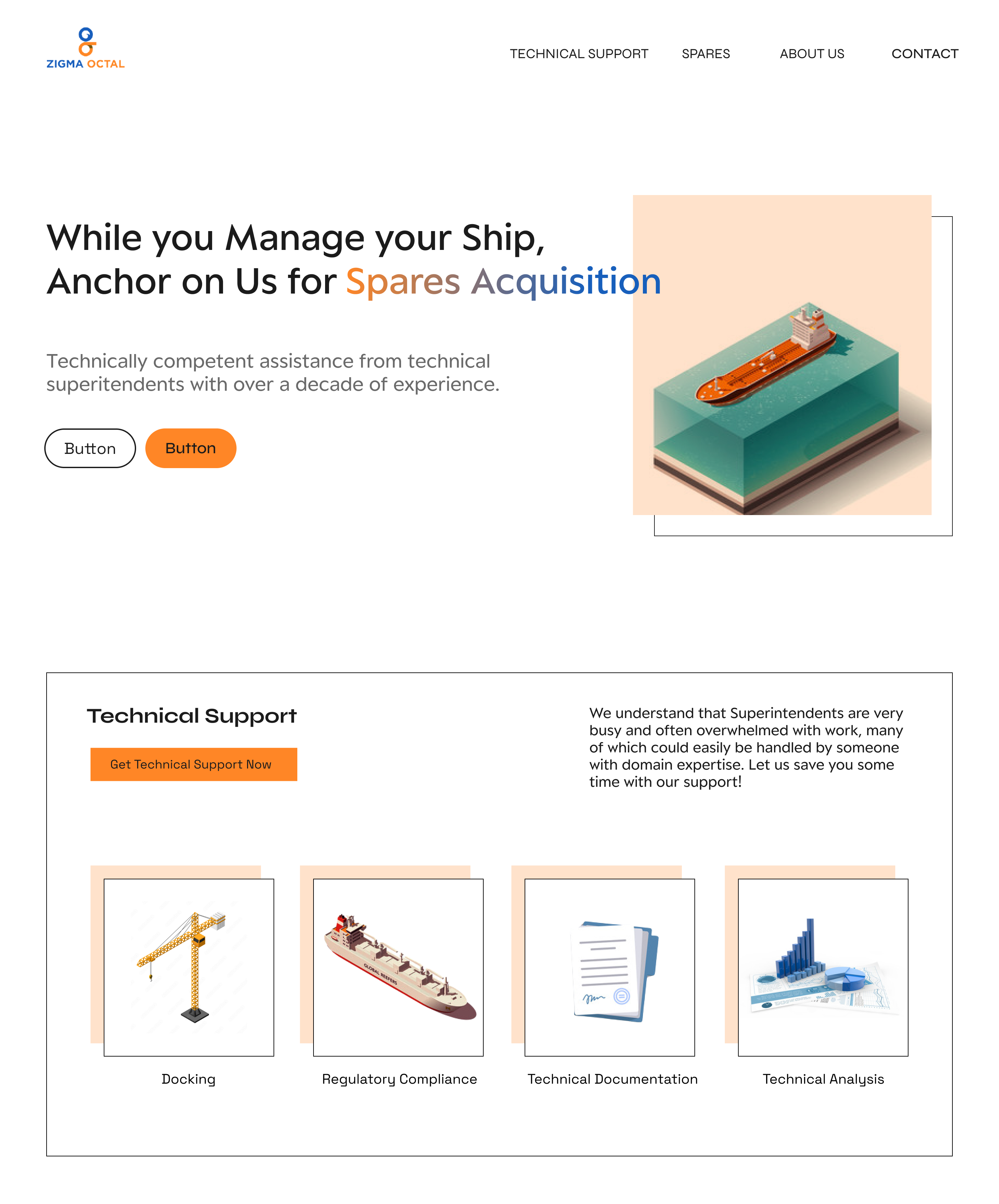
I explored angles, geometry and playfulness in this version. But it tipped the edge too far; the business wanted to keep it fairly formal but introduce playfulness through colour and animations.
Reflections and Impact
IMPACT
60% increase in customer acquisition! Establishing a digital identity has allowed the business to streamline communication and speed up its customer acquisition process.
DEVELOPER CONSTRAINTS
This was my first time working with a freelance developer. The developer was found, only after the design was complete. Hence, we had to work within the constraints of the business's budget. The prototype, presented with detailed annotations did not fully resemble the final build. Some visual principles were ignored and animations were not implemented. But this was a lesson in designing for small businesses - be aware of the constraints before creating solutions.
WORKING WITH A SMALL BUSINESS
Working with a small business to establish a digital identity for them was an exciting challenge. I was lucky the founders knew exactly what they wanted so the design process was transparent and seamless. However, constraints and user information were not apparent so I had to feel my way through the process, iterating till the very end to make this possible.