Product category visualization for e-commerce merchandisers
ROLE UX RESEARCH, UX+UI DESIGN, PROTOTYPING, USABILITY TESTING
TEAM UX DESIGNER, PRODUCT MANAGER, DEVELOPERS, TECH LEADS
CONTEXT
What are product categories?
Have you browsed through categories of products while shopping online? These are organized by merchandisers whose jobs encompass classifying products within the appropriate categories.
Elastic Path's e-commerce management software allows them to organize and manage their products within categories. However, the interface was falling short for users who were managing a large number of products, thousands sometimes.
CHALLENGE
Why was this put on the roadmap?
Enable enterprises of all sizes to benefit from the product categorization feature, addressing usability issues specific to larger enterprises.
Unobscure the power of the product to handle large sets of data by making it apparent on the UI, benefiting sales and customer acquisition
Differentiate the product on the market through an interactive, modern interface.
Research
I began by filtering out insights gathered from speaking with teams that directly hear about user concerns such as support and customer success. This helped me identify themes to inform my other research methods.
OBSERVING USER BEHAVIOUR ON THE CURRENT INTERFACE
A theme that emerged from speaking with support and customer success teams was difficulty in navigating the interface to manage products and their categories. To get deeper insights into this, I observed user sessions on a tool called FullStory.

Losing Context
The process of creating and updating product categories was fragmented, often causing users to lose context of the tasks they were doing.

Poor searching capabilities
There was no capability for users to find a product category. They often had to go through a large list of categories to locate the right one.
No State Management
Fragmented processes and weak search capabilities led users to spend extra time retracing steps, as the system failed to manage prior action states.
CURRENT STATE OF THE INTERFACE INFORMED BY INSIGHTS ON USE CASES FROM USER SESSION OBSERVATIONS
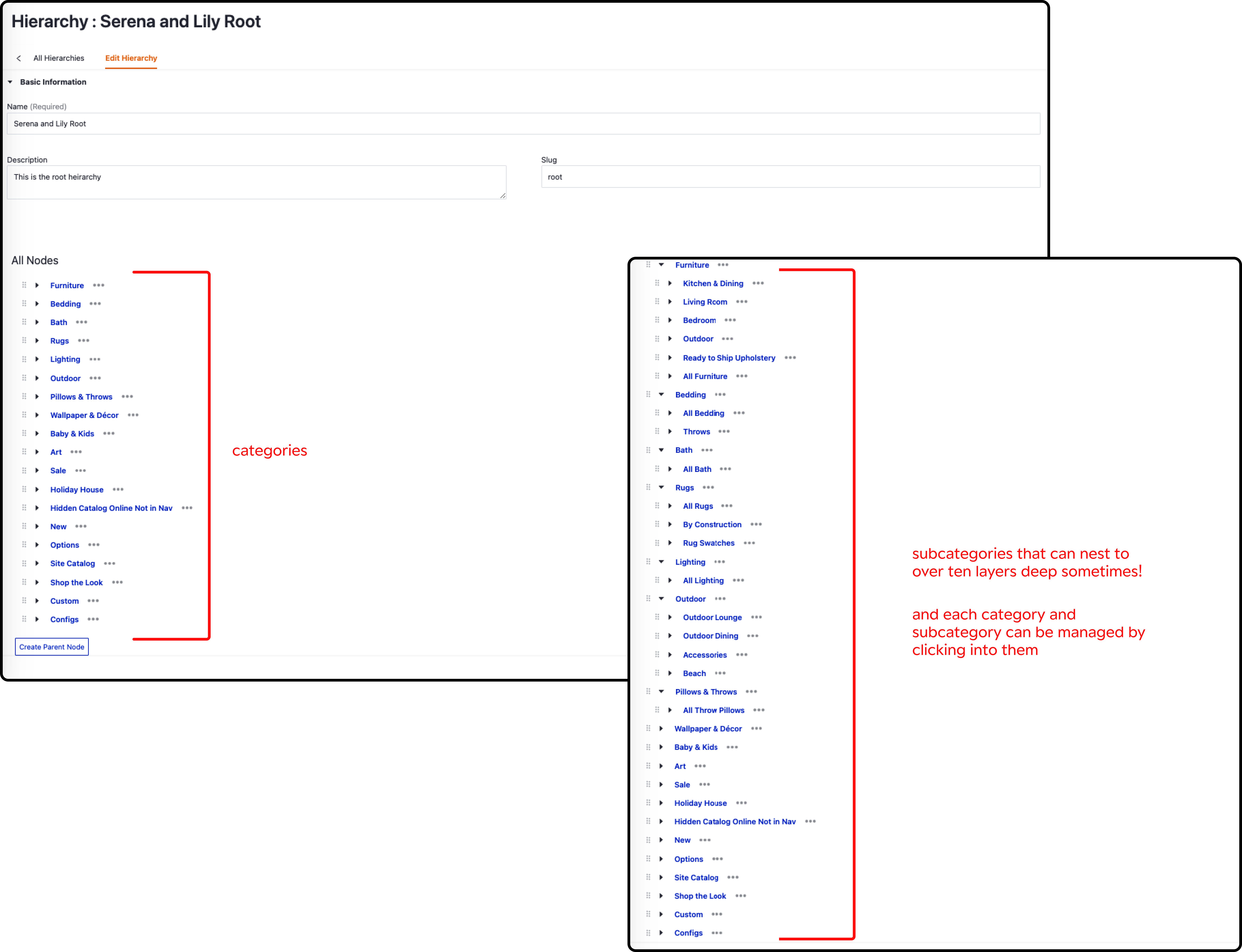
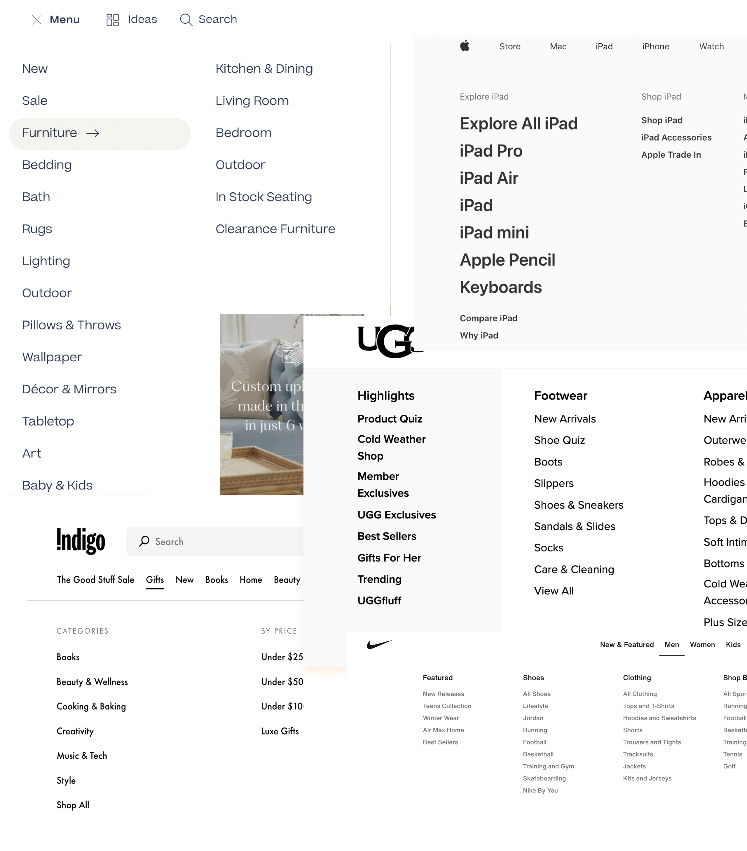
Users are dealing with a lot of data
The categories displayed on each storefront are not the only categories managed on the system. This means they are dealing with a lot of data
High Cognitive Load
Data is not presented in a manner that can be easily accessed and worked on. Visual cues do not adequately guide users, making it difficult to form mental models to guide their everyday tasks.
Inadequate vision of how categories look on the website
The relationships between categories and subcategories are hard to decipher. In addition, the users often have to resort to their own tools to visualize how these would show up on their websites.
LEARNING ON ACADEMIA - HOW ELSE CAN PARENT-NODE RELATIONSHIPS BE VISUALIZED?
While exploring other enterprise management systems, locating direct examples of handling large datasets was challenging. So, I gathered insights from academic papers and online data visualization software to learn principles for organizing categorized data.
Horizontal vs Vertical presentation of data
When data is organized based on categories, research seems to support visualizing them horizontally across a two-dimensional screen.
Make visualization flexible through multiple Views
Data-heavy displays that require fast visualization seem to benefit from having multiple viewing options to compare values.
Line Graphs
Managing categories involves managing relationships between products. Line graphs could help imply connections because connected things in the world tend to belong to the same objects
Intentional Grouping
Closed contours, lines and colours seem to be effective ways to group data. Tables with the most salient information on the top left might also help group data efficiently.
Defining goals based on research Insights
USER GOALS
Manage relationships between multiple categories efficiently.
Users spend a lot of time reorganizing the relationships between categories. They need a reliable and efficient process to accomplish this.
Locate categories and subcategories easily.
Finding a category to manage it is the most basic need for users. Categories can have the same names, increasing the risk of errors.
USER PAINS
Losing time adding value to their business
Poor state management, fragmented task flow, and search problems waste time and hurt revenue opportunities.
Difficulty envisioning store website
Users use thirs party apps to review categories before release. The website UI is inefficient in allowing visualization.
Poor visual cues and high cognitive load
In the current UI, the affordances are unclear and cause the user to lose context often, increasing effort on their part.
THE DESIGN CHALLENGE
How might we optimize the product categorization experience for varying needs of different enterprises?
USER FLOW
In the old flow, each task was on separate pages. Without proper state management, it made the process tedious and time-consuming. The new flow is streamlined with category and product management on the same page. State management will be ensured when it is being built.
Solutions
01
RESEARCH INSIGHT
Efficient workflow necessitates quickly finding a category from a lengthy list.
UX DECISION
Contextual search to locate categories or subcategories.
Categories and subcategories can often have the same names but have different relationships to eachother. To help users locate the right categories and reduce the possibility of making changes to the wrong ones, we settled on a contextual search solution.
LO-FI EXPLORATIONS

TECHNICAL CONSTRAINTS
Since a large number of results could be returned, to maintain performance, we had to stay away from continuous search and at least three characters needed to be entered before a user triggered a search query. For the user to be directed to a category, they will have to click on a category from the list to be navigated to that category.
HI-FI DESIGNS
After feedback from the team and learning about constraints, we settled on a simple contextual search. When a user inputs a search term and clicks enter, results filtered by category or subcategory will be displayed. After a search result is clicked on from the list, the user is navigated to the relevant category.
02
RESEARCH INSIGHT
Merchandisers are used to managing products on spreadsheets. Getting used to new mental models adds cognitive load.
UX DECISION
Reduce cognitive load with user-friendly mental model creation. Provide diverse visualization options for different preferences.
LO-FI EXPLORATIONS
My research indicated that data involving categories are best visualized laterally. And that the most salient information is usually presented on the top left. This is in tune with the design of spreadsheets, the tools merchandisers claim to use most. Taking inspiration, I did lo-fi explorations. Grouping categories on the left, and subcategories on the right.
USER FEEDBACK ON LO-FI EXPLORATIONS
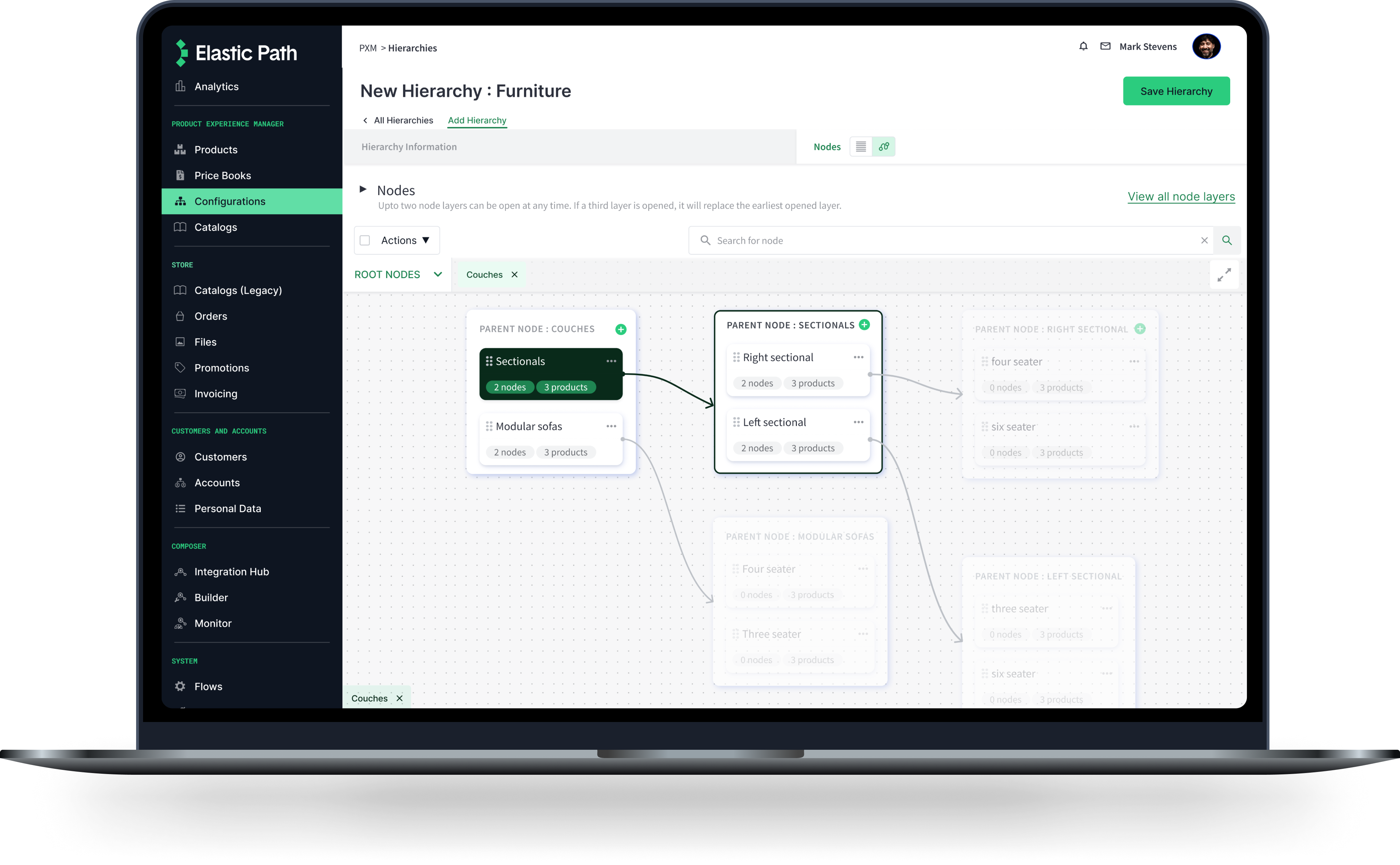
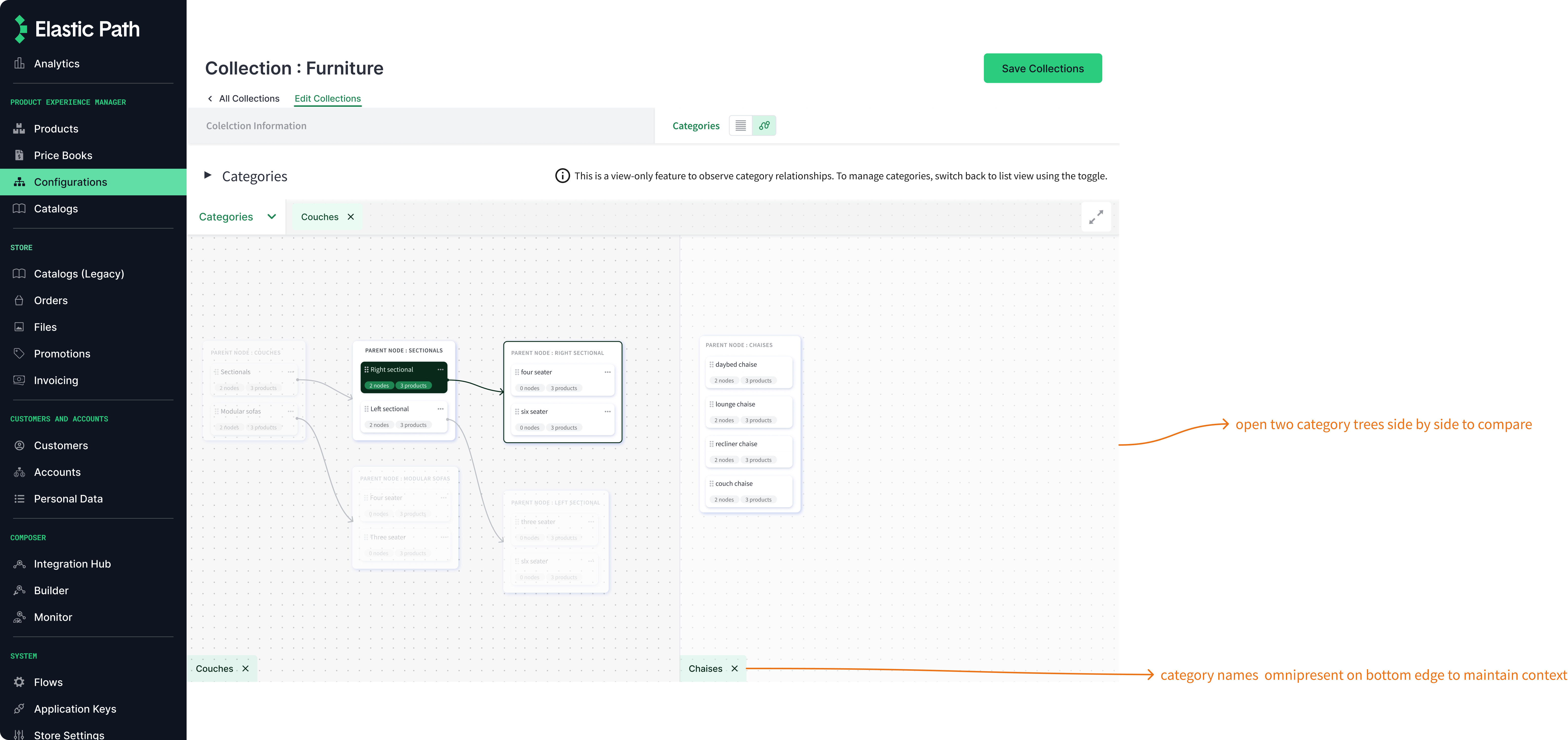
Asking users for feedback on lo-fi explorations, we learned that they would like to view and manage multiple category trees at once. So, we introduced side-by-side views of multiple subcategries with drag-and-drop functionality for them to compare and edit category relationships.
HI-FI DESIGNS
Categories grouped to the left, with subcategories displayed on the right. Users can drag and drop categories and subcategories across columns to rearrange category relationships.
03
RESEARCH INSIGHT
The product categorization process is inefficient because it is fragmented.
UX DECISION
Introduce a more streamlined process, ensure state management and contextual awareness.
The old flow involved clicking on a subcategory, being navigated away to a different page to manage it. When a user tried to come back to the category tree, they would lsoe context of what they were looking at.
The new flow displays the category management section right below the category section. Users can choose to manage a subcategory and they will be naviagted to the form below. Not losing context, all the while.
HI-FI DESIGN
04
RESEARCH INSIGHT
Users vary in preferences towards visualizing store website categories. Multiple visualization methods aid data-heavy displays.
UX DECISION
Provide an alternate view for users to visualize their categories. the view should not complicate their process, only enhance it.
There was push from management to design multiple views to visualize cateogry relationships. Since my secondary research and user research also suggested that multiple ways of visulaizing complex data relationships might benefit wide suer groups, I decided to design a second view.
LO-FI EXPLORATIONS
Research indicated that lines can be used as effective tools to visualize complex category comparisons (Metzner and Evergreen, 2013). Although an outlandish idea pushing UI boundaries at the company, I put together some lo-fi sketches to gauge interest from my team on whether a line graph would work as an alternate view. The enthusiasm from my team motivated me to run the idea by stakeholders and most importantly our users.
Users were excited about the possibility and liked the idea of an interactive way to visualize their categories...as long as it did not make their lives more difficult.
HI-FI DESIGN CONSIDERATIONS
The hi-fi designs were intially created to mirror the exact features on the other view. However, since the line graph view would have implications on performance given the size of data some users have, we decided to make it a view only feature. All the category management can be done using the other view.
Usability Testing
With UI updates so drastic, testing the usability was important to know if the changes can actually be improvements and not deterrents.
- I conducted moderated tests with 4 internal users and 2 customers. Since we involved users throughout the process to get their input while designing, feedback was minimal.
- Concerns were raised about the content and notifications. This is currently being worked on with the documentation team.
QUANTITATIVE RESULTS
50%
decrease in task completion time
100%
users completed all tasks without delay
100%
users located a cateogry on first try
QUALITATIVE RESULTS
4/5
How easy were you when performing each task?
5/5
How easy were the design elements to follow?
4/5
How easy was the content to follow?
Impact
Teaching myself visual design principles to create completely new interface components was the highlight of this project. I was able to create reusable components that are being used and scaled across the design team.
I am excited for the new interface to help boost user efficiency and help in the acquisiton of new customers through pre-sales demos.
Reflections
I did not realize how much I was taking on solo, for the UX process from research to delivery on this project. But the excitement with which it was received by stakeholders up to the CEO as well as our customers helped me realize the importance of the steps I took toward the success of this project.
- Always put the user's needs first. You can experiment all you want but if they do not align with user needs, it is wasted time.
- Maintain regular touchpoints with the team to keep constraints in check.
- When in doubt, test! Testing the lo-fi sketches and flows with users throughout the design process and not saving it till the end prevented us from going in circles. We could form a clear vision and execute it within the expected time constraints because of this.