Redesigning the Pill Component
ROLE UI DESIGNER
TEAM DESIGN TEAM, DEVELOPERS, STAKEHOLDERS
CONTEXT
Elastic Path is a company that creates software for e-commerce enterprises to manage their products. The service is data-heavy. Because of this, Effective ways to organize and identify data are needed.
The design team used a design system that we built and maintained. It was constantly in flux as new use cases were addressed with the acquisition of new customers.
Last year, designers expressed frustration that they could not decide when to use "tags" or "labels". The definitions for use were not clear, and the usability and consistency of these tabs were poor.
DESIGN CHALLENGE
How might the labelling and tag experience be improved to create a consistent user experience?
PROCESS
AUDIT
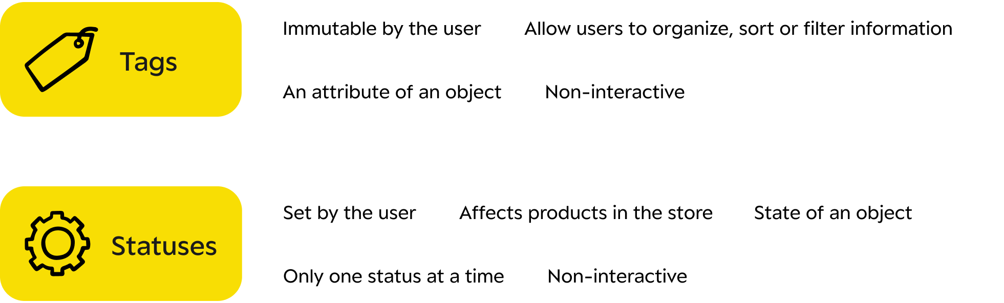
Two types of existing labels
There seem to be two categories of labelling. One to categorize objects for quick recognition when navigating the data. Other is a status used to define the state of an object. Both exist within tables that are used to organize data. However, the UI components seemed to have been used interchangeably across the service.
Category Labels
These labels are used to identify and categorize different types of objects across the service. Different colours exist, but the colours do not seem to indicate anything.
State Labels
These labels highlight a state set by a user for an object. The colours indicate active/inactive states in some sense. However, there is no consistency in using it across different parts of the service.
DEFINE
Tags vs Statuses
I brought back insights from my audit to the design team, and we brainstormed the differences between the labels. We defined them as tags and labels based on their characteristics. We did this exercise to identify valid use cases and, through that, reach a common understanding of the components that need to be redesigned.
SOLUTION EXPLORATIONS
Redesign only the tags
From the definition of tags and labels, we identified characteristics for each. We then decided that statuses do not need to be redesigned, only made consistent across the service. This was because the meaning of statuses stayed consistent across the services.
However, we decided tor redesign tags. This was because the use cases varied across the service. The current component had various colours and treatments that did not signify anyhting specific.
DESIGN PRINCIPLES
Align with rebranding guidelines
The company was going through a rebranding, introducing new colours and types of styles to the brand. So we decided to leverage that to create consistency.

Use colour to group tag categories
Currently, the colours do not offer any significance to the tag categories. Intentionally use colour to group tags so they can be easily identifiable as users glance through the service.

Indicate its (lack) of affordance clearly
The tags are usually located within table cells in the interface. The team felt that the tags should stand out enough for them to be glanceable but should not call for any action.
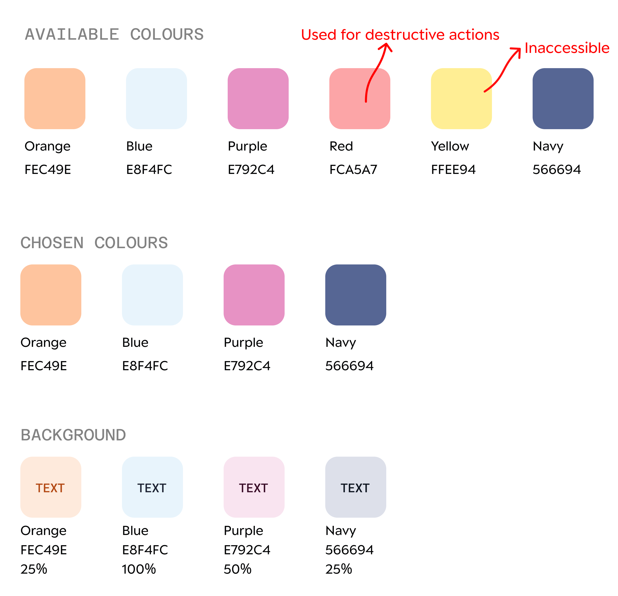
Colour
Prescribed from rebranding
The rebranding had a prescribed set of colours that could be used for accessory components. White, green, black and white were primary and secondary colours, so I chose to use colours that stood out against these.
I avoided green and red also because they were used to indicate statuses and destructive actions across the interface.
Accessibility and Opacities
The colour palette was vast and had a huge variety of hues. But the lightest colours were not light enough. So, I chose to explore varying opacities for backgrounds and chose to use the darkest hues for the text, keeping accessibility in check.
Number of Colours
The use cases across various parts of the service varied. When consulting with other designers, we learnt that a maximum of four tag groups existed. So we decided on picking 4 colours.
Type
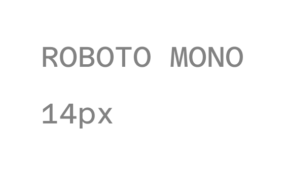
Adapted from rebranding
The body and header type was Inter. Roboto Mono was prescribed as an accessory type. However, concerned about accessibility, I was hesitant but chose to use uppercase and bold letters to cover this. I wanted to use this to differentiate it from buttons to indicate that it was view-only and not clickable.
Size - The tags would be used inline with other body text in the tables. So, I chose to keep it consistent at 14px to enhance its glanceability.
Pill Form
I chose to stick to a pill to differentiate it from Statuses that did not have any containers.
Corner Radius
The interface mostly has sharp edges or minimal rounding at the edges. So I explored a style that aligned with the current style and a more rounded pill to differentiate it from buttons.
We also planned to add icons to the pills in the future so the rounded edged accounted for that.
Solution
The Grey Tag - When used inline with text to indicate the type of service an object belonged to, we agreed to use the navy tag consistently across the interface.
The Coloured Tags - The other colours are used to categorize an object. The colourful tags were chosen for this to make visual grouping more apparent.
Impact
IMPACT
The consistent tagging system minimized back and forth with engineers and designers, improving our efficiency. This also improved the consistency and usefulness of tags across the system, improving user experience.