Product creation workflow for e-commerce merchandisers
ROLE UX RESEARCH, UX+UI DESIGN, USABILITY TESTING
TEAM UX DESIGNER, PRODUCT MANAGER, ENGINEERS
WHAT DOES ELASTIC PATH DO?
Elastic Path makes software as a service for e-commerce enterprises to manage their products to swiftly create unique experiences, bypassing the need for an engineering team.
THE CHALLENGE
The product creation process's interface had not kept up with changing customer use cases. My challenges were:
- to optimize the product creation experience to the workflows of our users
- overhaul the UI and modernize the interface to keep up with competitors
IMPACT
For the business: This design update aims to enhance user onboarding and efficiency by over 50%.
For the design team: I revamped the UI for forms and introduced reusable components, benefiting designers organization-wide.
Check out the prototype.
Click through the prototype, be guided by hotspots!
DISCOVER
01 / Business Motivation
I initially sought to align business goals with user goals. Meetings with executive stakeholders, pre-sales and customer success teams provided insights into both current customer issues and prospective customer needs.
WHY WAS THIS PUT ON THE ROADMAP?

Make the power of the software readily visible.
A product needs to be created to be managed on the platform. Elastic Path's e-commerce software provides flexibility, but users have complained the interface lacks clarity, causing inefficiency in the process.

Enable rapid customer value through product-led growth.
The company adopted a product-led growth strategy, aiming to reduce onboarding costs and promote rapid customer value. The current product creation process requires users to repeatedly read documentation and get help from support.

Overhaul the User Interface to rival competitors.
The interface feels dated, and organized how the API was built and not based on user workflows. The sales team highlighted customer losses due to the UI's aesthetics and navigation issues, prompting immediate business mitigation.
DISCOVER
02/ Research
Competitive Analysis
I audited 4 competitors' product CRUD processes to identify common product creation patterns and opportunities.
User Sessions on FullStory
To gather insights about user behaviour on the service, I observed recorded user sessions on a tool called Fullstory.
Reviewing Customer Support Tickets
Analyzing customer requests, I understood historical issues and how they were prioritized to be resolved.
Contextual User Interviews
Working with Customer Success, I organized virtual interviews with users to explore their daily interactions with the interface.
COMPETITIVE ANALYSIS
I analyzed e-commerce software catering to different users, from small businesses to large enterprises. Since the company's goals include customer acquisition beyond the existent large enterprise customers, this helped understand needs and variations across user groups.
USER SESSION OBSERVATIONS ON FULLSTORY
01
Back and Forth Navigation Pattern
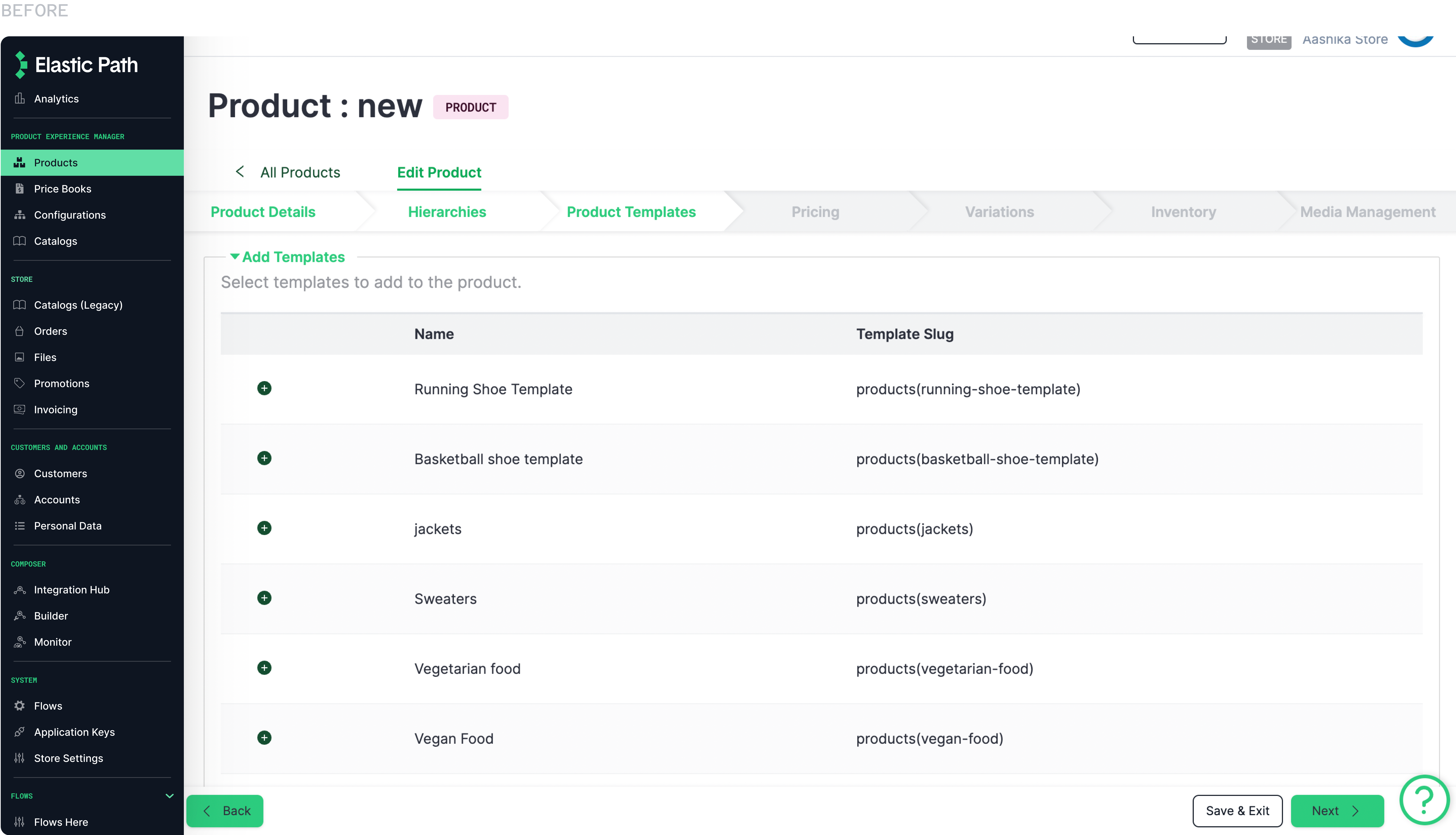
Because there are multiple tabs, users often seem to navigate across multiple tabs to find one piece of information about a product.
02
Rage Clicks due to unclear actions
Interface elements get disabled without clear indication when creating different product types, causing user frustration and uncertainty about consequences.
CUSTOMER SUPPORT TICKET INSIGHTS
01
Poor Discovery
Users raised concerns, assuming certain features were nonexistent, when, in reality, they were not named or easily identifiable.
02
Poor System Feedback
System feedback was poor and inconsistent. Our design system did not have fleshed out notification elements and we realized this was a problem.
03
Images were not prioritized
In e-commerce, imagery often drives product sales. Our workflow lacked clear affordances for adding images, and saving conventions were suboptimal.
USER INTERVIEW INSIGHTS
Informed by the insights, I chose to do semi-structured virtual contextual interviews via Zoom. We asked users to walk us through a day in their life using our service while contextually informing us why they were performing each action. Probing them with questions based on insights helped us identify their user journeys, including their pains and goals.

Onboarding troubles
"I now know how to create a product but if we had to bring someone new in, we would lose so much time just teaching them how to."

Lack of Trust
"I am often worried that I am going to lose all the work I did or worse fail to make a product available in our store. Every second has a dollar value in e-commerce"

Diverse workflows
"Multiple merchandisers work on a single product, necessitating vigilant saving and awareness of ongoing changes to the product."
DEFINE
03 / Define
After the first stage, I filtered through all the information and shared it with my product team to generate shared insights. Since the product creation process would need to cater to a wide range of users, with different business structures, I took inspiration from the Jobs To Be Done framework to identify the design challenge through the main jobs to be done.
MAIN CUSTOMER PROBLEMS
01
Unoptimized product creation process.
Instead of managing products and focussing on revenue generation, merchandisers need to spend time figuring out how to create products and rectifying errors.
02
Trust and reliability were lacking, frustrating users.
Unreliable action confirmation, unclear saving conventions and a weak notification system keep making users double-guess their actions, often worried about the impact of their actions.
JOB TO BE DONE STATEMENT
When creating a product, I need a quick and reliable process that allows me to swiftly display it on our website, without impacting revenue generation.
DESIGN CHALLENGE
How might we optimize the product creation process to help users efficiently create products to swiftly start selling them on their storefronts?
HIGH LEVEL USER FLOW
Sharing insights from the audit, and discovering that the journeys of creating a product are similar across user groups, I put together a high-level flow for the revamped product creation process. The focus was on keeping it simple, flexible and focussed on keeping the user informed.
DESIGN STRATEGY

Design for mindsets.
Streamlining and simplifying the product creation process will involve redesigning the interface with users' contexts in mind.

Design trust into the process.
To instil trust, keep users informed about the outcomes of their actions and system processes.

Design for flexibility.
To optimize for various workflows and attitudinal differences across user groups, we will make the experience flexible.
04 / Design
I involved developers early and often in the design process to keep technical constraints in check and improve the efficiency of the delivery of this project.
AUDITING THE STATE OF THE PRODUCT CREATION WORKFLOW
Before jumping into solutions, I audited the state of the interface with the project's principles in mind. Derived from research, this helped surface usability and heuristic issues in the current interface and task flow.
SOLUTIONS
01 / Designing an intuitive product-led process
RESEARCH INSIGHT
The company adopted a product-led growth strategy and exisiting customers wanted to minimize onboarding efforts.
UX DECISION
Guide the user through the product creation process. Allow experiences and new users to have a seamless experience.
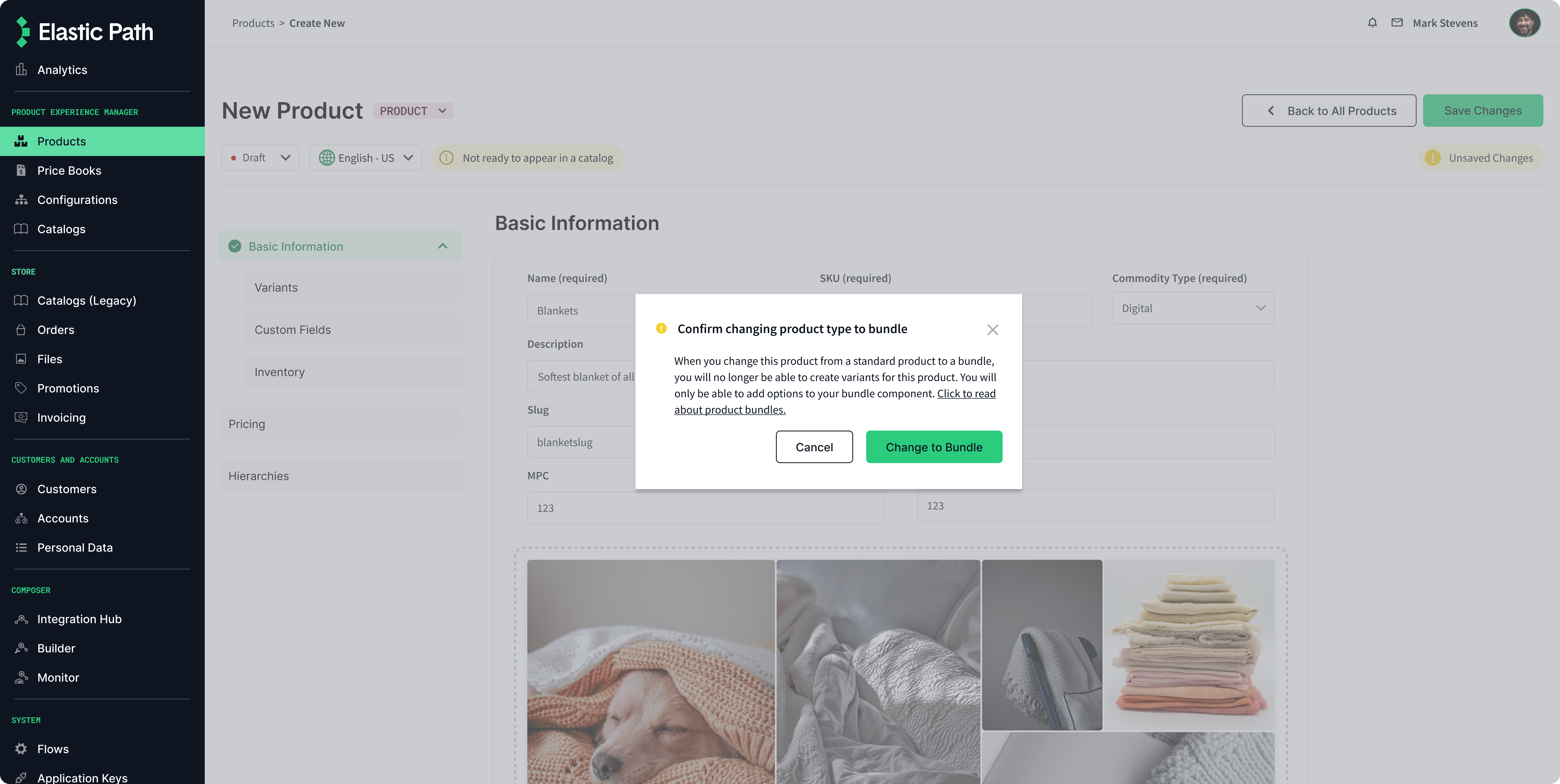
DISMISSABLE INFORMATION CARDS
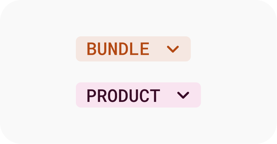
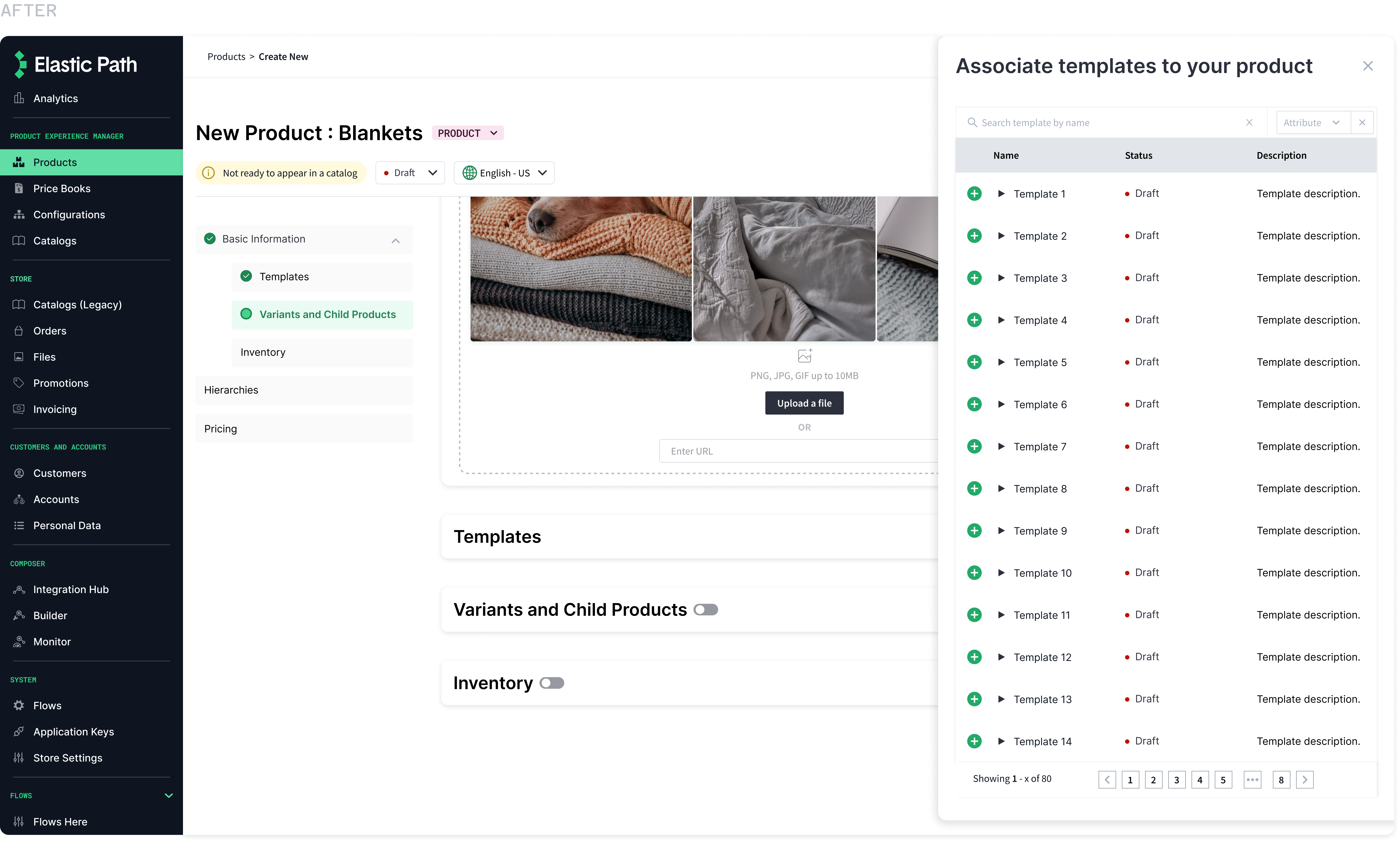
New users are presented with context on what types of products can be created. Returning users can choose to dismiss the screen. They can still choose between two possible product types for a streamlined process.
A huge reason for doing this was because most of our new/existing users reported that they did not that they could create two different types of products. This was a business differentiator, and we wanted to highlight this.
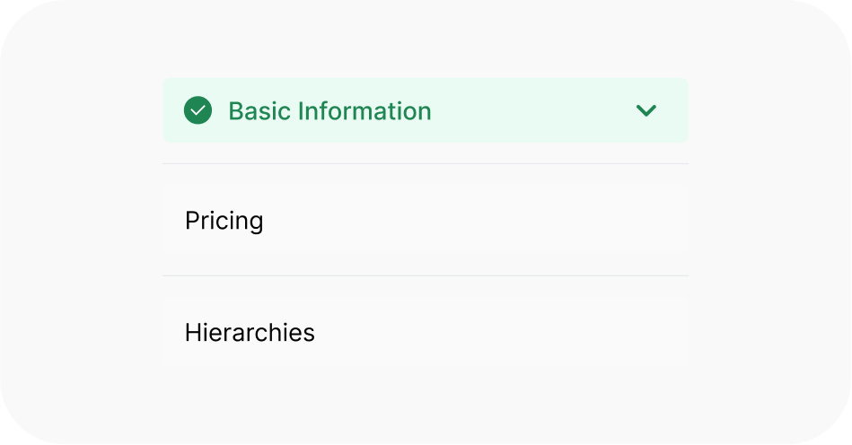
STREAMLINED FLOW
Flexible navigation and toggleable form sections to guide them through their workflow instead of prescribing a workflow. I created two different guided experiences for the two types of products that can be created. The overall layout remained the same so users did not have to spend time figuring out how to create different products.
Constraint : Since 'pricing' and 'hierarchies were disconnected in the backend architecture, we were forced to locate them on separate pages. We ordered the 'basic information' section of the navigation based on observations of common workflows.
SOLUTIONS
02 / Designing trust into the workflow
RESEARCH INSIGHT
Trust and reliability are crucial to ensuring the right product information is shown in the stores.
UX DECISION
Keep the user informed of important changes and the state of their products within the software and in the store.
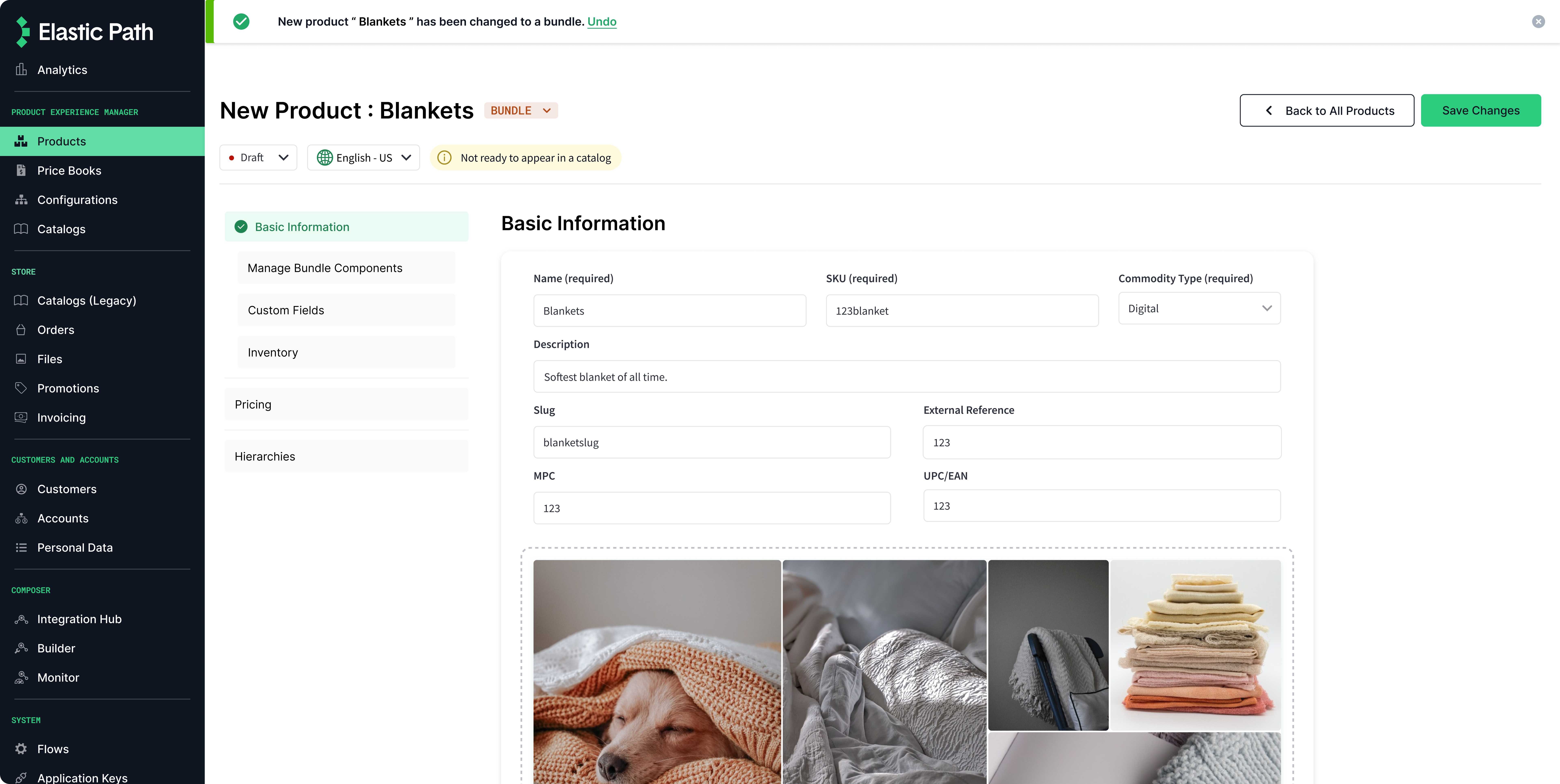
Indicators showing product readiness to be displayed on website to be shopped.
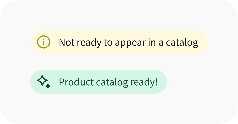
TAGS AND INDICATORS
Tags keep the user informed about what type of product they are creating.
Check marks on navigation to show areas of the product that have been worked on.
KEEPING THE USERS INFORMED
Modals and notifications instil confidence in users by informing them about the changes made to a product.
SOLUTIONS
03 / New Components to Reduce Clutter
RESEARCH INSIGHT
The process is data-heavy. The current layout is not intuitive. Product Attribute sections being spread across tabs is impacting efficiency.
UX DECISION
Group form components based on relevance. Organize them to mirror common workflows. Reduce clutter by making it glanceable.
REDUCING CLUTTER
For subprocesses, not directly connected to the product creation form, the old UI had components that were making the UI overhwelming and hard to follow. So, I introduced a slideout component to make the UI less-distracting.
Reflections
As I was conducting contextual user interviews, I realized that our users spent a large part of their workday interacting with our product's interface. This taught me that, if our service was hard to use, it impacted their quality of life at work. The biggest lesson from this project was that part of making the process intuitive was designing for their mindsets at work.
Aashika Ashok