Elastic Path • 2024 • shipped
Redesigning product creation so merchandisers launch faster, with fewer errors.
TIMEFRAME
2024 • 1 Quarter
ROLE
Sole UX Researcher + Designer
DOMAIN
E-commerce • B2B SaaS
team
Product Manager • Developers • Tech Lead
What's Elastic Path?
Elastic Path is a b2b e-commerce platform where merchandising teams create, manage, and publish products to storefronts.
What was the gap?
Product creation was one of the most important workflows in the platform, but the legacy experience had grown feature by feature without a clear system. Teams had to move across disconnected pages, interpret hidden dependencies, and trust unclear save and publish behavior.
What was my impact?
PLG focussed modernized UI + design system.
57% reduction in customer support tickets.
4 new customers acquired after the redesign.
The Problem
The legacy UI didn't match how teams worked and was costing revenue.
Product creation was hard to scan, hard to trust, and easy to break. Products failed to appear on storefronts, and merchandisers rarely knew why.
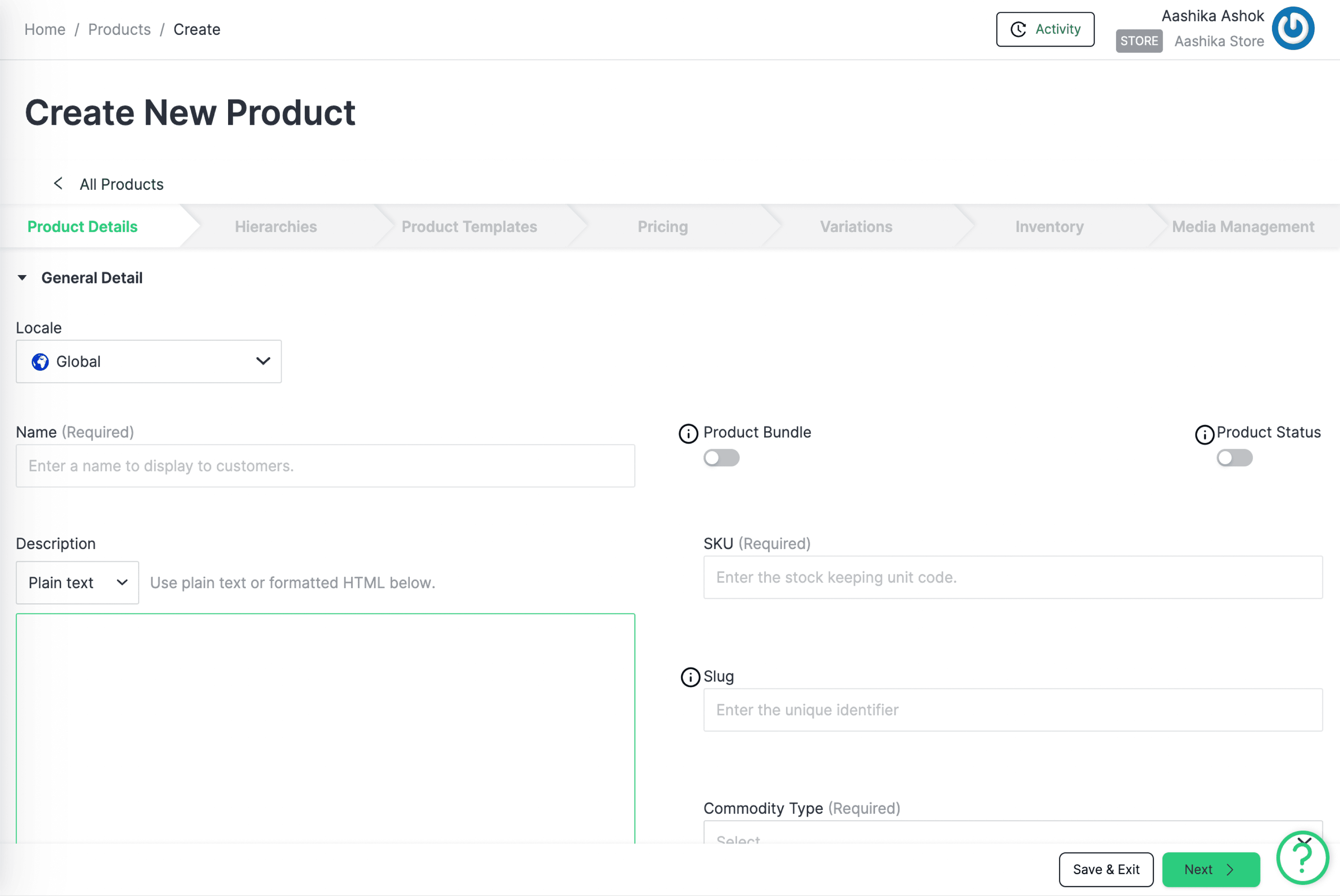
The legacy product creation UI, annotated with the four critical issues below.

Uptick in unsolved support tickets
Products were not showing on storefronts and merchandisers had no idea why.

Complaints from the Sales team
A clunky UI was costing us sales. Prospects chose simpler tools that looked better.

Critical usability issues → losses
Behavioural analysis revealed the legacy UI did not support all teams losing time and money.
Research
Research revealed two very different merchandisers with the same blind spot.
I used four inputs to understand where the workflow broke down.
4 competitors' CRUD processes to identify patterns and opportunities
Tracked and ranked issues based on criticality.
50+ behavior analytics sessions on PostHog to identify friction points.
5 Zoom sessions to understand daily customer interactions with the interface.
Remote
Contextual
Inquiries
User Session
Observations
Heuristic
Analysis
Competitor
Analysis
I learned there were two user groups with different workflows but the same blind spot: no visibility into whether a product would actually publish.
Multiple collaborators per product across complex catalogs.
Need: Coordination, visibility, error prevention.
Small businesses
One person merchandising team handling simple catalogs.
Need: Simplicity and reliability.
Solution
I redesigned the workflow and UI components around how teams think, with product readiness visible at every step.
I reframed the redesign around three questions users needed answered at all times:
Where am I?
What needs attention?
Is this product ready to publish?
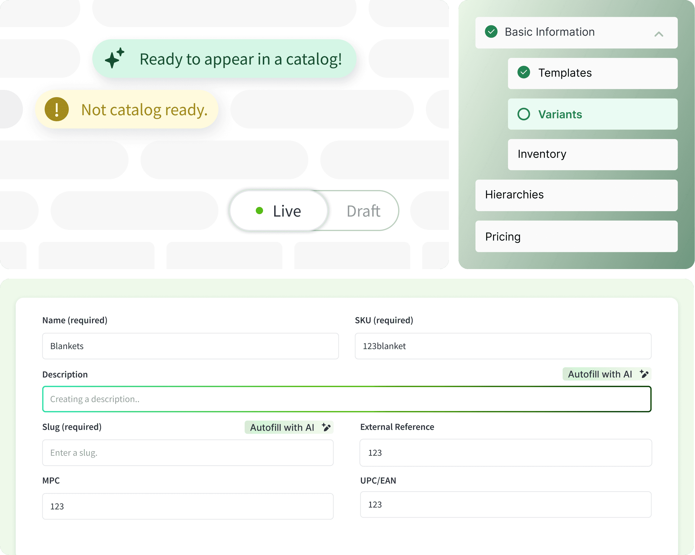
[01] Workflow-driven forms
Research finding: Form fields were fragmented across pages, and users had to hunt for hidden dependencies.
Design system response: Reorganized forms into workflow-based sections with clearer grouping, helper text, and progressive disclosure.
[02] Status indicators
Research finding: Product readiness was invisible
Design system response: Introduced status pills to make product readiness visible before publish. This made discovering issues proactive, before it appeared on a storefront.
[03] Side navigation as workflow map
Research finding: Product readiness was invisible
Design system response: Introduced status pills to make product readiness visible before publish. This made discovering issues proactive, before it appeared on a storefront.
[04] In-context slide-outs to keep the workflow streamlined
Research finding: There are many moving parts to creating a product and all of them lived in separate pages.
Design system response: I created slide out panels for quickly selecting attributes to add to a product. Scaled across the platform.
usability testing and impact
Validated with users: 100% task completion, 33% faster, and 57% fewer support tickets.
I ran cognitive walkthroughs with the sales team and existing merchandisers. Task completion time dropped, the SUS score jumped from 64.3 to 88.5, and the redesign helped win 4 new customers while adding 7 reusable components.
Quantitative Insights
100% task completion rate
33% decrease in task completion time
Improved SUS Score
Old SUS Score
64.3
New SUS Score
88.5
Reflection
Design systems are strongest when they make complex workflows easier to trust.
This project taught me that design systems are most valuable when they encode product logic, not just visual consistency. By turning fragmented forms, unclear navigation, and invisible publishing states into reusable patterns, the team gained a shared language for how products move from draft to ready to live.
The components were adopted across the platform because they solved a recurring problem: helping users understand progress, risk, and readiness in complex workflows. that shift improved customer trust, reduced support burden, and gave future teams a stronger foundation to build on.
↩