
Redesigning product creation so merchandisers launch faster, with fewer errors
Products were silently failing to publish with no status visibility quietly costing revenue. I led the end-to-end redesign of Elastic Path's product creation workflow that improved efficiecny and led to increased ARR.
TIMEFRAME
2024 • 1 Quarter
ROLE
UX Research • UX Design
DOMAIN
E-commerce • B2B SaaS
TOOLS
Figma • ChatGPT • PostHog
TEAM
Product Manager • Developers • Tech Lead
What's Elastic Path?
A e-commerce platform where merchandising teams create, manage, and publish products for their storefronts.
What was the gap?
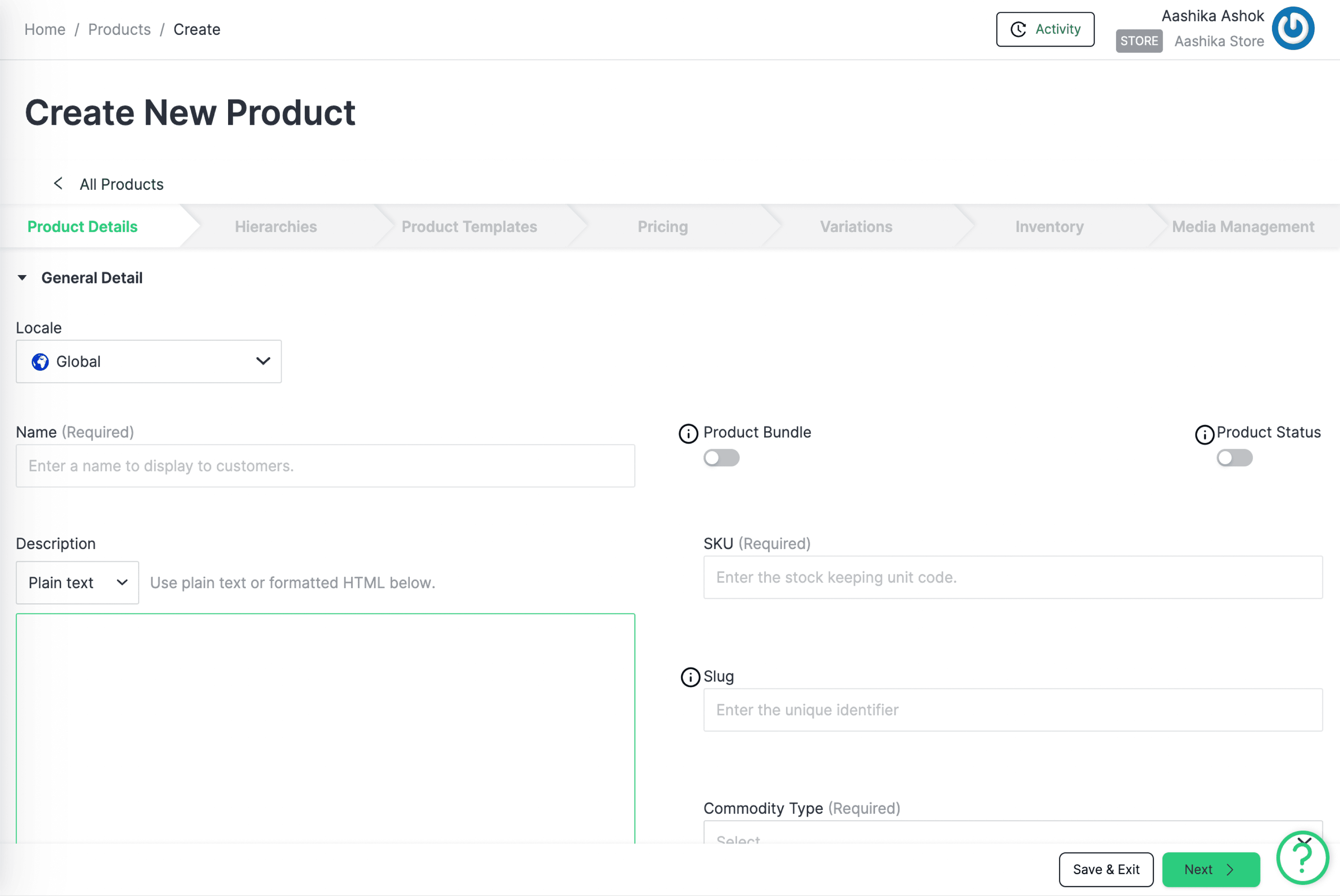
The legacy UI did not match how teams actually worked. Products silently failed to publish with no status visibility, quietly costing revenue and driving up support tickets.
What was my impact?
57%
reduction in customer support tickets.
4
new customers acquired after redesign.
12
new form and status indicator components in the design system.
The legacy UI didn't match how teams worked — and it was quietly costing revenue

Uptick in unsolved support tickets.
Products were not showing on storefronts and merchandisers had no idea why.
Complaints from the Sales team.
A clunky UI was costing us sales. Prospects chose simpler tools that looked better.

Critical usability issues -> losses
Behavioural analysis revealed legacy UI did not support all and teams were losing time and money.
Research revealed two very different merchandisers with the same blind spot
4 competitors' CRUD processes to identify patterns and opportunities
Tracked and ranked issues based on criticality.
50+ behavior analytics sessions on PostHog to identify friction points.
5 Zoom sessions to understand daily customer interactions with the interface.
Remote
Contextual
Inquiries
User Session
Observations
Heuristic
Analysis
Competitor
Analysis
01 → Enterprise teams
Divided, specialized CRUD
Multiple collaborators per product across complex catalogs.
Need: coordination, visibility, error prevention.
02 → Small business
One person does everything
Basic features, simple catalogs, no handoffs.
Need: simplicity and reliability.
I rebuilt the workflow around how teams think, with product readiness visible at every step
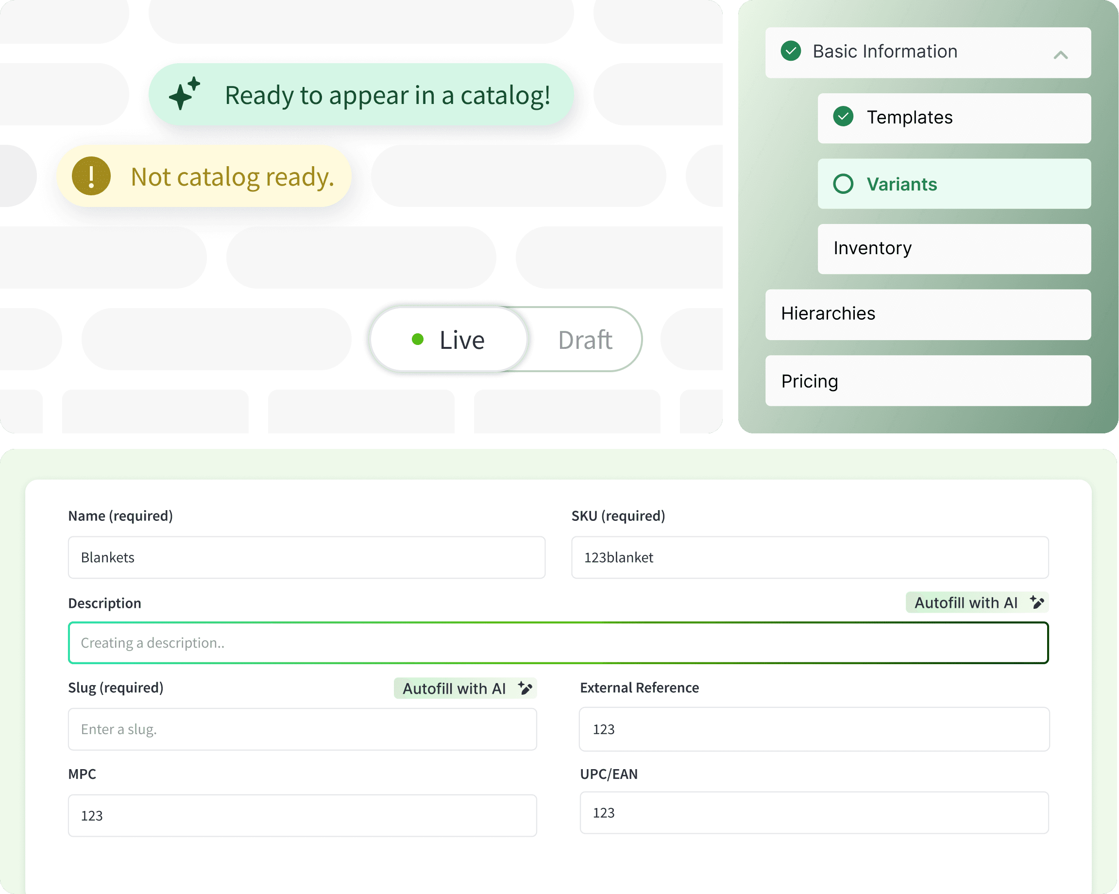
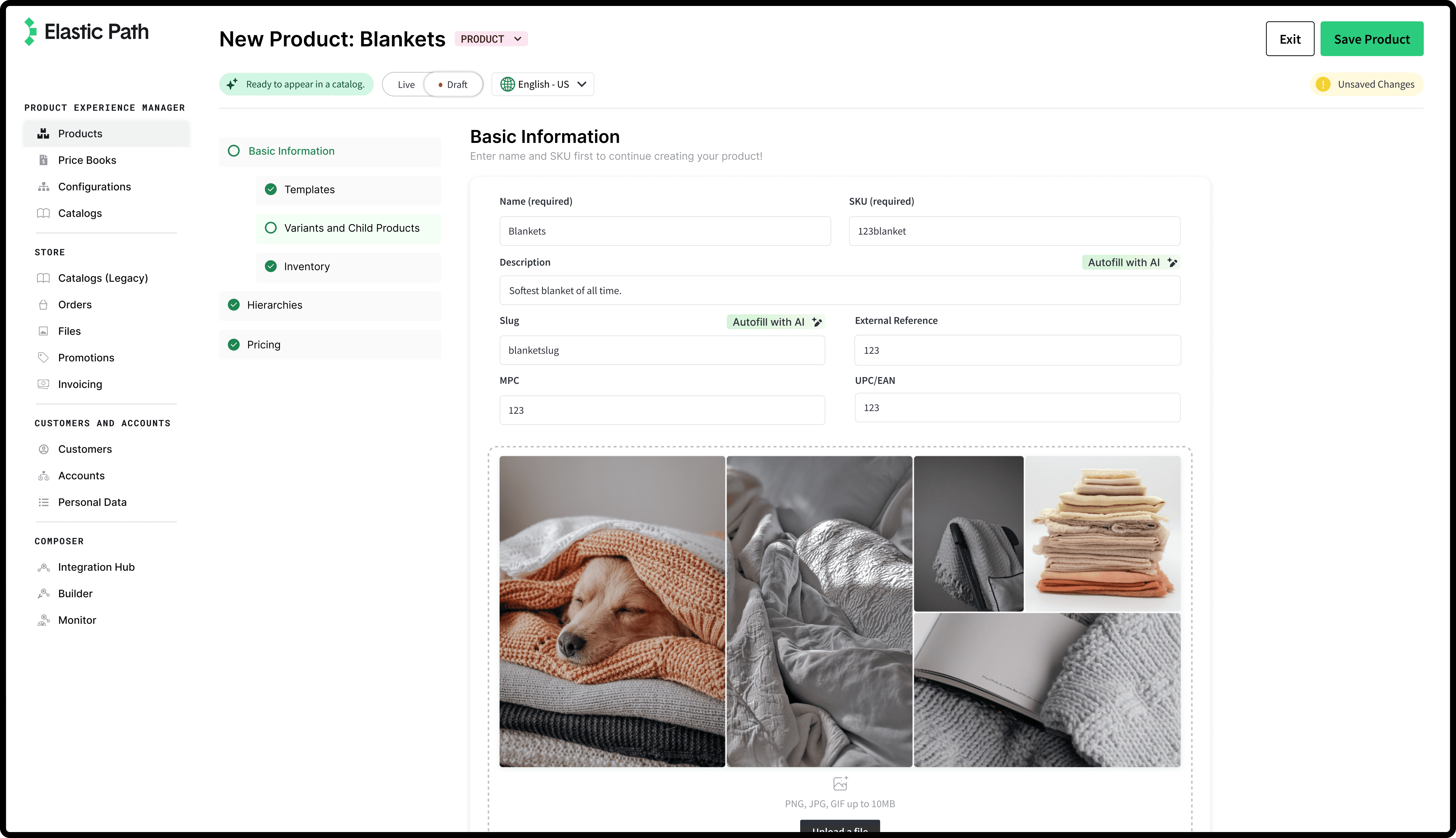
A ground-up redesign that maps each form to the team's mental model and surfaces status throughout so nothing silently fails to publish.
01
Workflow-driven forms
Form flows mapped to each team's mental model, so every step feels logical instead of arbitrary.
02
Live status indicators
Product readiness shown at a glance, so nothing silently fails to publish on the storefront.
03
AI-assisted fields
Auto-generated suggestions cut manual effort and reduce errors on repetitive product fields.
04
Product-led onboarding
Contextual guidance surfaces key features and reduces early drop-off for first-time merchandisers.
Validated with users: 100% task completion, 33% faster, and 57% fewer support tickets
I ran cognitive walkthroughs with the sales team and existing merchandisers. Task completion time dropped, the SUS score jumped from 64.3 to 88.5, and the redesign helped win 4 new customers while adding 7 reusable components.
Quantitative Insights
100% task completion rate
33% decrease in task completion time
Improved SUS Score
Old SUS Score
64.3
New SUS Score
88.5
My biggest lesson: making stakeholders care about the data mattered more than the data itself
Presenting research is very different from making stakeholders care about it — getting engineers to expand scope mid-project took reframing findings around what mattered to them. Usability testing also surfaced broken back-end structures we'd never have caught otherwise, and reinforced that trust — built through status visibility and reliability — drove adoption more than any single feature.
Thanks for reading. I care about building calm, trustworthy tools and the people who use them.